pheatmap_advanced
Case 1
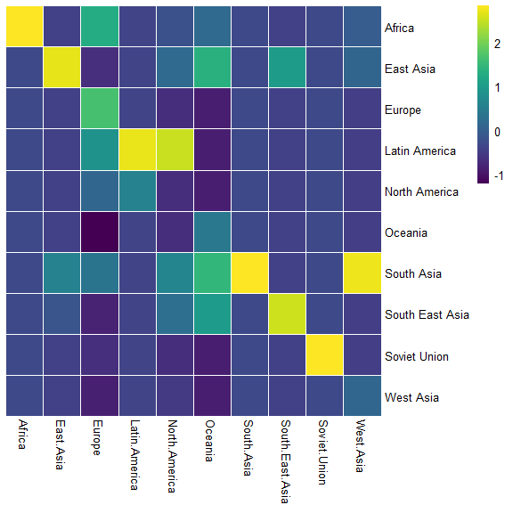
The datasets were provided by data-to-viz
library(tidyverse) |
|
Africa |
East.Asia |
Europe |
|
|---|---|---|---|
|
Africa |
3.142471 |
0.000000 |
2.107883 |
|
East Asia |
0.000000 |
1.630997 |
0.601265 |
|
Europe |
0.000000 |
0.000000 |
2.401476 |
### the following function were embeded in pheatmap source code |
case 2
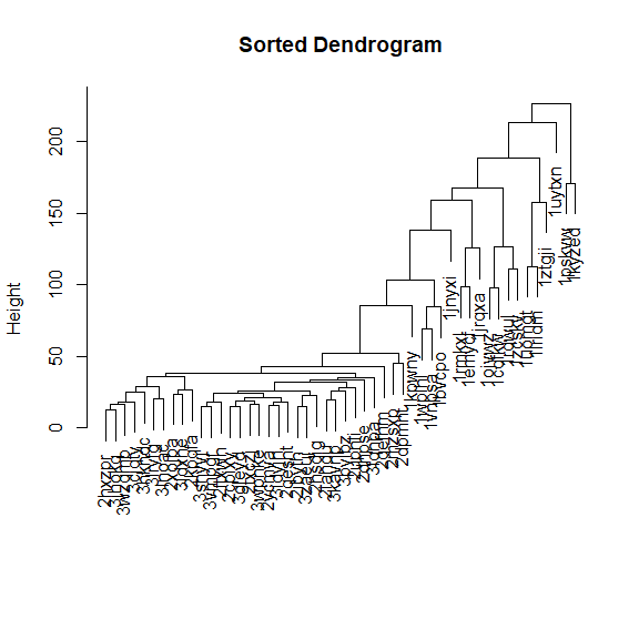
the codes were adapted from slowkow Sort dendrogram is very important
set.seed(42) |
|
1jrqxa |
1pskvw |
1ojvwz |
|
|---|---|---|---|
|
abv |
9.6964789 |
9.172811 |
2.827695 |
|
nft |
0.9020955 |
15.575853 |
4.328376 |
|
xha |
2.6721643 |
3.127039 |
1.765077 |
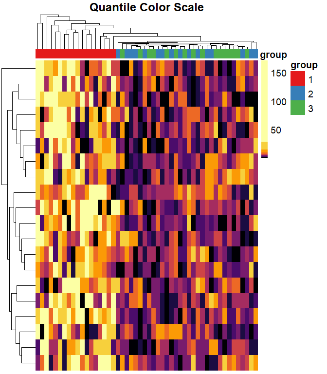
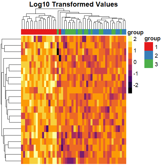
split data into 3 groups, and increase the values in group1
col_groups <- substr(colnames(mat), 1, 1) |
making the heatmap
# install.packages("pheatmap", "RColorBrewer", "viridis") |
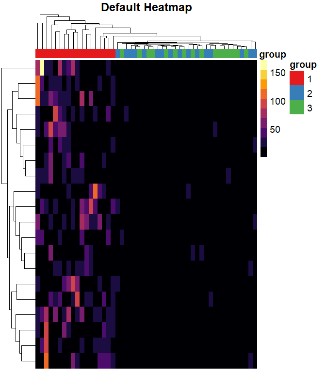
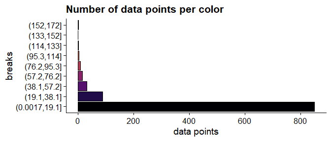
The default color breaks in pheatmap are uniformly distributed across the range of the data.
We can see that values in group 1 are larger than values in groups 2 and 3. However, we can’t distinguish different values within groups 2 and 3.
## ----uniform-color-breaks------------------------------------------------ |
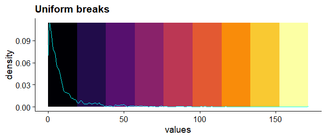
there are 6 data points greater than or equal to 100 are represented with 4 different colors.
dat2 <- as.data.frame(table(cut( |
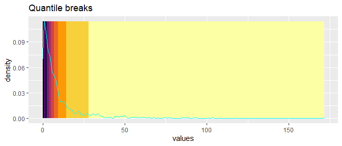
If we reposition the breaks at the quantiles of the data, then each color will represent an equal proportion of the data:
quantile_breaks <- function(xs, n = 10) { |
lets see
dat_colors <- data.frame( |
dat2 <- as.data.frame(table(cut( |
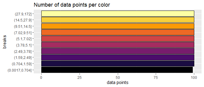
When we use quantile breaks in the heatmap, we can clearly see that group 1 values are much larger than values in groups 2 and 3, and we can also distinguish different values within groups 2 and 3:
pheatmap( |
We can also transform data
pheatmap( |
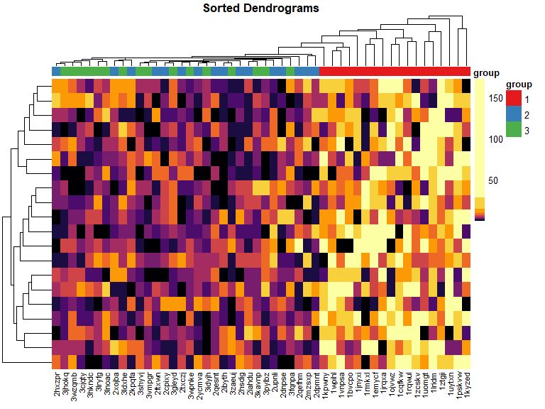
sort dendrograms
library(dendsort) |
sort Dendrogram heatmap
mat_cluster_rows <- sort_hclust(hclust(dist(mat))) |
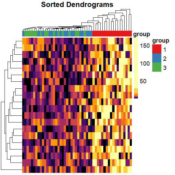
change colnames angle
pheatmap( |